One of the core principals behind Unread is that it never truncates article titles, subscription titles, or summaries in article lists. You never see text in an Unread article list that ends abruptly with ellipses (…). Jared Sinclair, the original developer of Unread, wrote the following in 2014:
Most RSS apps are patterned after email. Noisy parades of dots, dates, and tags trample over their screens. Their source lists look like overflowing inboxes instead of stately tables of contents.
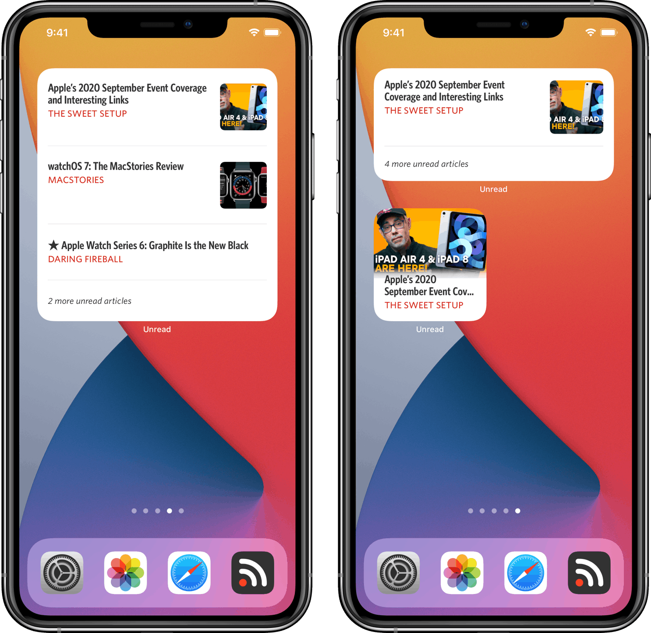
I share the belief that truncating text in order to make it fit on the screen should be avoided when possible. When I started building the Recent Articles widget for Unread, I wanted to avoid truncating article titles. But article titles often need to be truncated to fit into a small widget, even when not displaying an image. In the medium and large widget, truncating an article title can sometimes be necessary to make it fit even as the only article in that widget — especially on a smaller phone or on a device with a large text size setting.
I seriously considered not developing a small version of the Recent Articles widget, but I knew that many customers would want one. I considered excluding articles whose titles would not fit in the medium and large version, but I encountered cases where there was one unread article and that article had a long title. In such a situation the widget would show only read articles even though there was an unread article. I considered, and even implemented, catching such cases and making the widget only show a count of unread articles. I quickly concluded that not showing any articles was unacceptable.
I considered reducing the text size until an article title would fit, but sometimes the resulting text size was just too small.
I decided that the small version of the Recent Articles widget should always show the most recent unread article, or the newest read article if there are no unread articles. It should also always include the thumbnail image if there is one unless the Show Thumbnails widget setting is off. Often doing so requires truncating the title.
I arrived at these policies for the medium and large version of the widget:
- If there are unread articles, do not show any read articles unless there is room after including all unread articles.
- Always show at least one recent article. If there is at least one unread article, show at least one unread article. If the widget does not do this, it is failing. If doing so requires truncating the title, truncate the title.
- After ensuring that the widget shows at least one article, do not show any additional articles where doing so would require truncating the title of that article.
- If an article has a thumbnail image and if excluding that thumbnail allows the article to fit in the widget, exclude the thumbnail for that article.
- If there are more unread articles than fit in the widget, show the number of unread articles. This sometimes impacts the number or specific set of articles that can be shown in the widget. It also sometimes means that the title of the single article that can fit in the widget needs to be truncated, but it is important to convey that there are additional unread articles.
- Never reduce the text size to accomodate long titles. Accessibility and legibility are more important than avoiding truncation.
- Do not sacrifice margins or other whitespace to accomodate long titles.
Most of these policies seem obvious to me in hindsight, but honestly it took a summer of trial and error to arrive at them. I hope you agree that the end result of these policies makes for a home screen widget that is both useful and visually appealing.